When I was in college I actually took some graphic design courses that helped us learn the basics of various Adobe programs, most of which aren’t in use anymore and the ones that are are so different that the class might as well have happened on Mars.
All that to say, I’m familiar with the ideas of design, but I wouldn’t exactly call myself good at them, so I can’t throw stones at bad art.
What I *can* do, however, is throw laughter at them. Which is what I’m gonna get at for the next little while thanks to these amazing design fails via Reddit.
10. There’s no place like it!
Also it’s no place!
9. A bad fit
“So like, two puzzle pieces, one with coffee and the other with a donut.”
“Got it, I am definitely a reasonable person and you do not need to be more specific.”
8. Welcome, hoe
When you just need a little judgement as you return to your abode.
7. It’s in the text
There are so many things wrong with this. At least it has the excuse of being done by a high schooler.
6. Travel the world!
Yanno, it’s one of those places with a building or whatever.
5. The smear
I see what you were going for, but no. No thank you.
4. Get some
To be fair, maybe the whole point was to make you do a double take and look closer?
3. Una Polo
Thought maybe this was somebody telling me to be a chicken in Spanish.
2. The best bite
What is wrong with you?
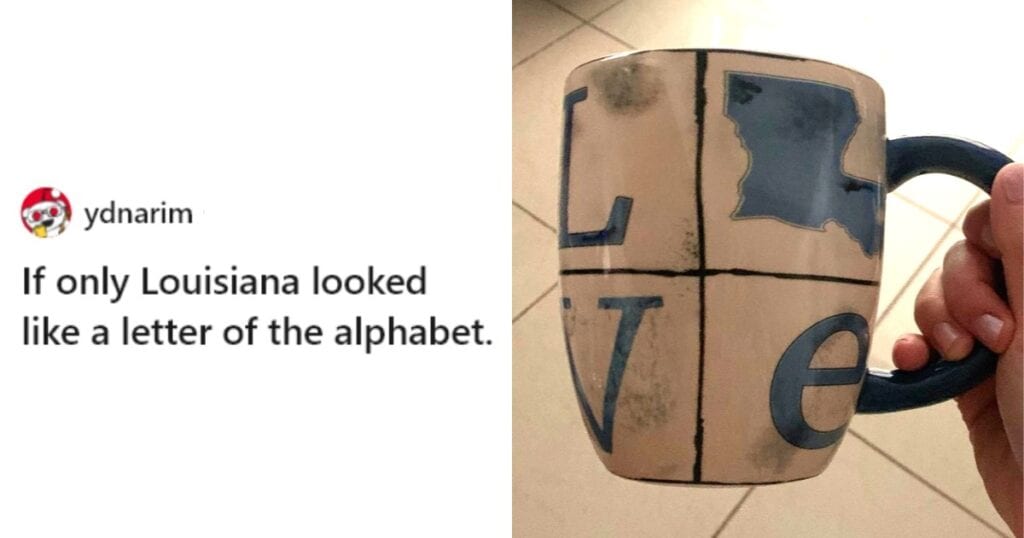
1. LLVE
We are REALLY having trouble squeezing love into place names, huh?
Fails so glorious they really belong in a museum.
What’s been your biggest fail lately?
Tell us in the comments.
