I guess when you get right down to it, the whole point of graphic design is to create something that is a) memorable and b) attention-grabbing.
And what could possibly be more memorable or attention grabbing than something that just straight up stops your brain because of how baffling it is?
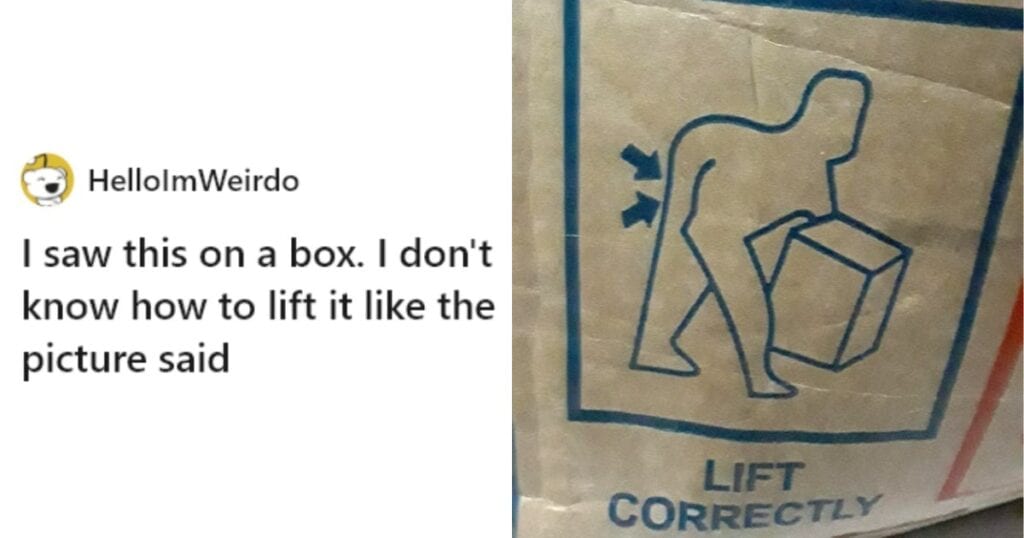
With that in mind, as we scroll through these graphic design fails brought to us by Reddit, we have to ask: ARE they really fails? Or are the people behind these things secret geniuses?
We can’t know. There’s just no way to know.
10. I My Bike
“Make ’em in red and black.”
“But, the heart is-”
“YOU HEARD ME!”
9. Wait, what?
We were seek ma was born the world you the were I go was born.
8. I’m on a roll
This feels right on the border between clever and disturbing.
7. Assume the position
Is this designed for some kind of lost monkey man?
6. A pro gamer move
Yeah I think that’s just cheating.
5. Line Up 4
Look, if you’re gonna make a rip-off game, that’s fine, but could you put in like TEN minutes of effort?
4. There is no spoon
What they were trying to do here truly isn’t difficult, and somehow they failed anyway.
3. Get a leg up
Denis Leary’s great secret has finally been revealed.
2. Get her
How do you not look at these things at least ONCE before selling them?
1. Saints protect us
He looks as confused as any of us.
If you’re gonna do some design, maybe have somebody proof it. It could save you a trip to a list like this.
What’s your biggest fail as of late?
Tell us in the comments.
