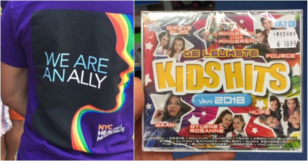
Do you know what kerning is? It’s the spacing between letters that makes everything easy to read on signs, clothes, etc. And it’s important because, if the kerning is off, the whole meaning of what you’re trying to say gets messed up.
And that’s EXACTLY what happened in these cases. It’s quite tragic, actually…
1. Sungl asses
Photo Credit: Reddit
2. You had meat “hello”
Photo Credit: Reddit
3. Buzzards are good
Photo Credit: Reddit
4. Uh oh
Photo Credit: Reddit
5. GMNG THANKS
Photo Credit: Reddit
6. Just a few d%cks
Photo Credit: Reddit
7. Don!
Photo Credit: Reddit
8. That’s really not good
Photo Credit: Reddit
9. bea ut if ul
Photo Credit: Reddit
10. Ooops
Photo Credit: Reddit
11. Jud Ging U
Photo Credit: Reddit
12. Fig hater?
Photo Credit: Reddit
13. Bum Foundation
Photo Credit: Reddit
14. Yes, that is appropriate
Photo Credit: Reddit
15. Who signed off on this?
Photo Credit: Imgur
NG = Not Good.
